Night at the Museum Trimester 2 Blog
Presentations
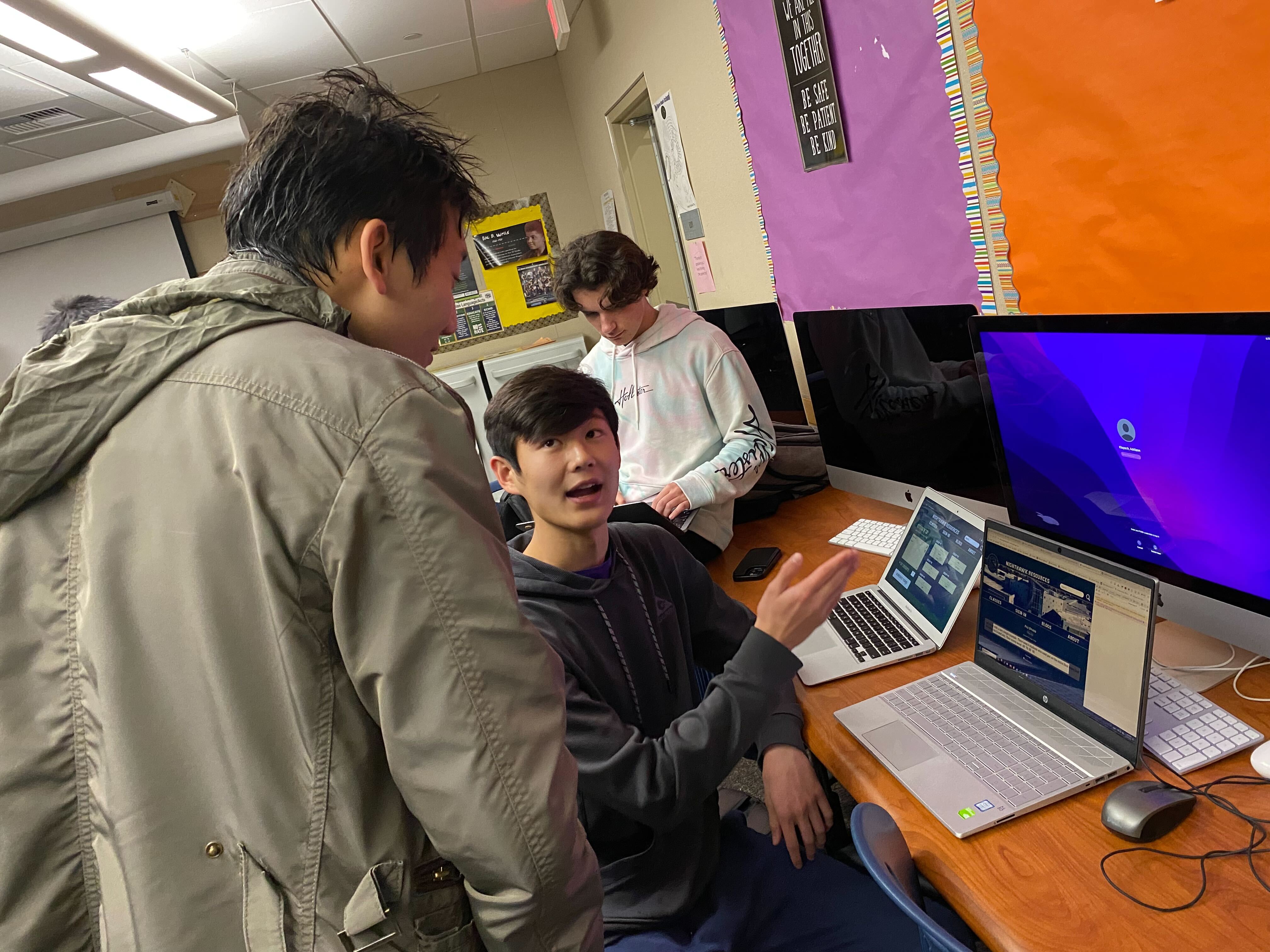
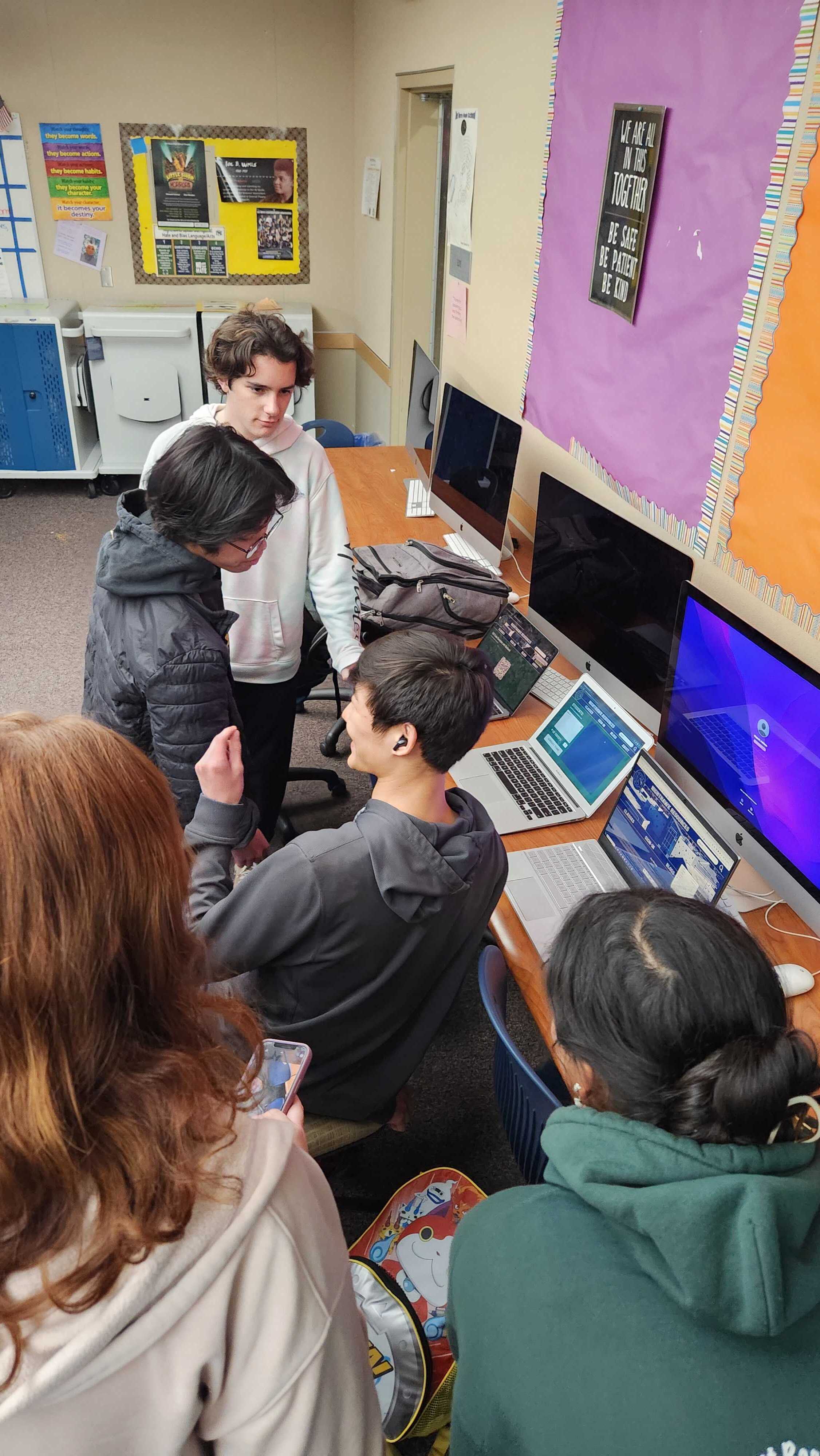
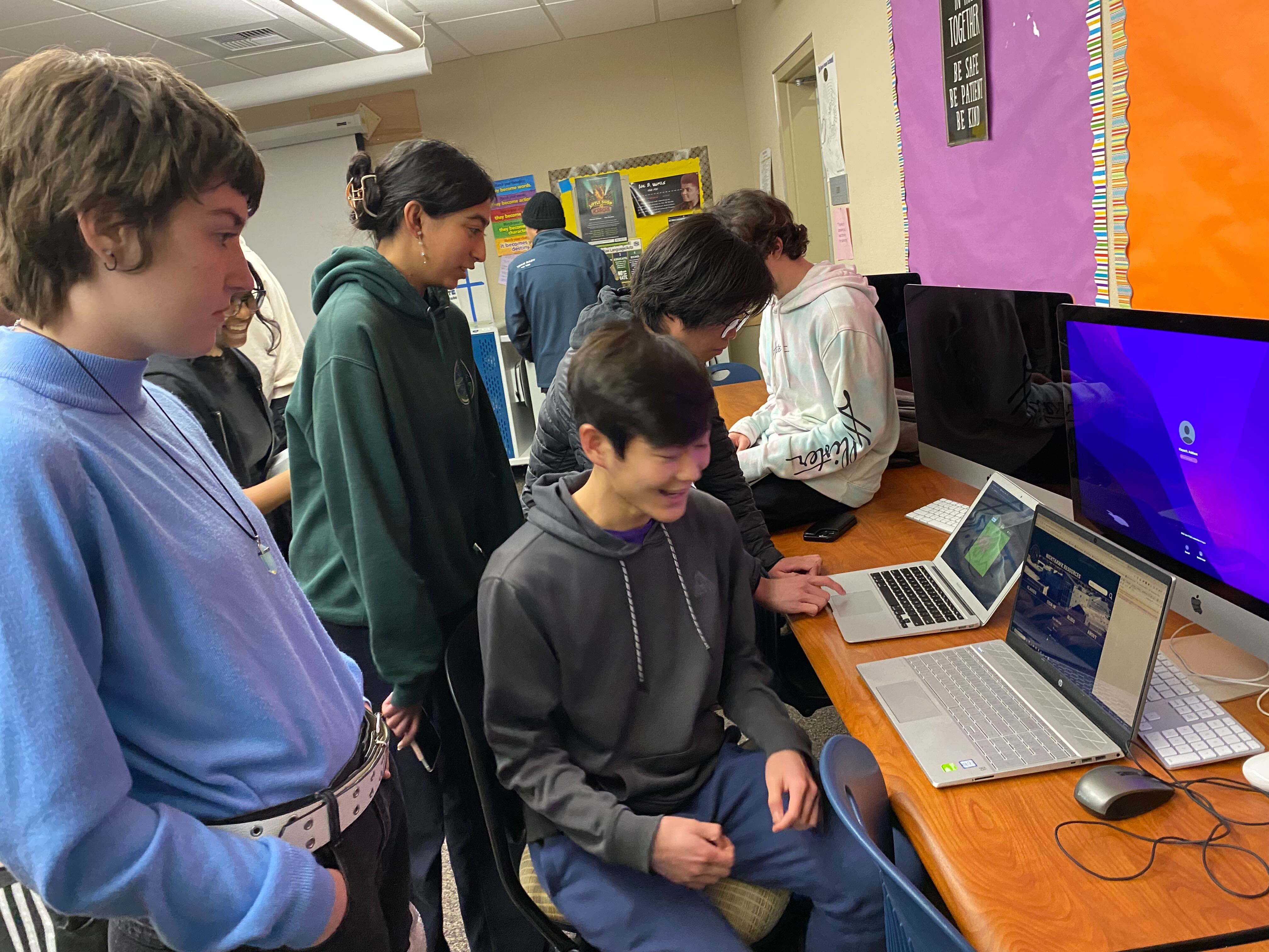
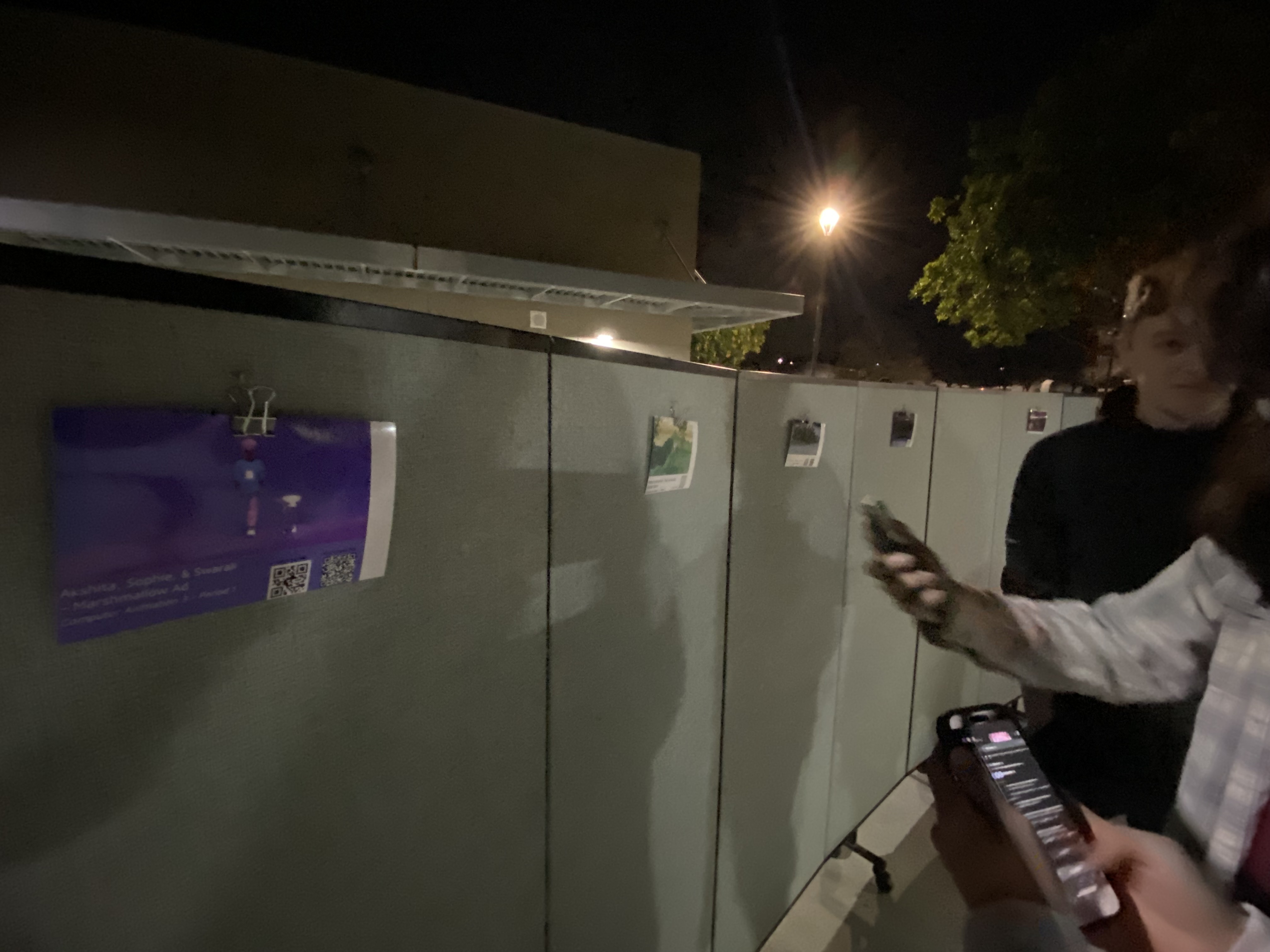
We presented our site and its features to at least 8 groups of people throughout the half-hour period we had the table.
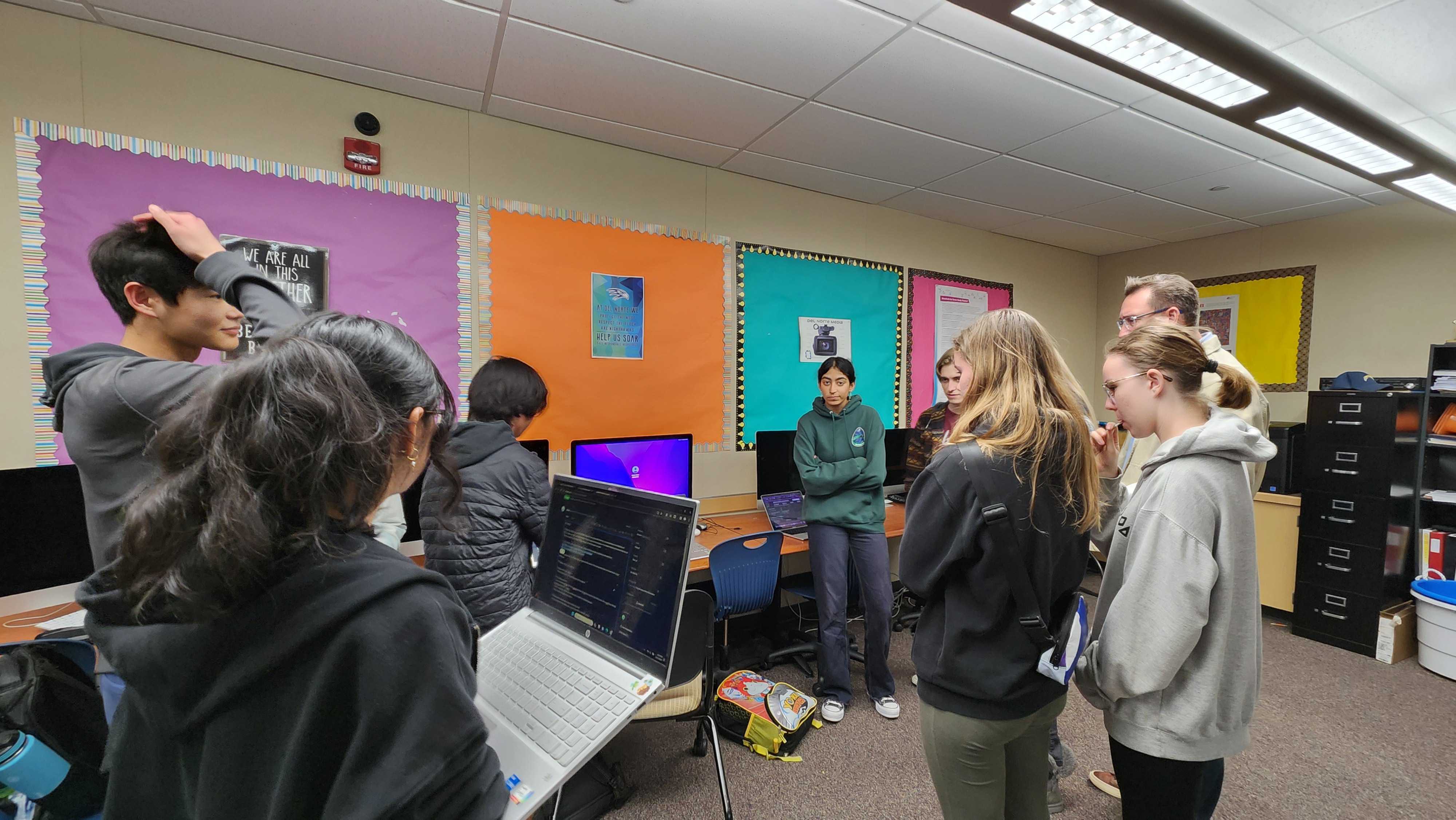
Each presentation went over:
- Sign-in and dashboard displays
- Class and assignment viewing on the frontend
- Assignment creation
- Image recognition
- Random table generation
For some reason, QR code generation wasn’t working correctly that night, so we only showed it to a couple groups. When the period ended, Toby began work to fix it.
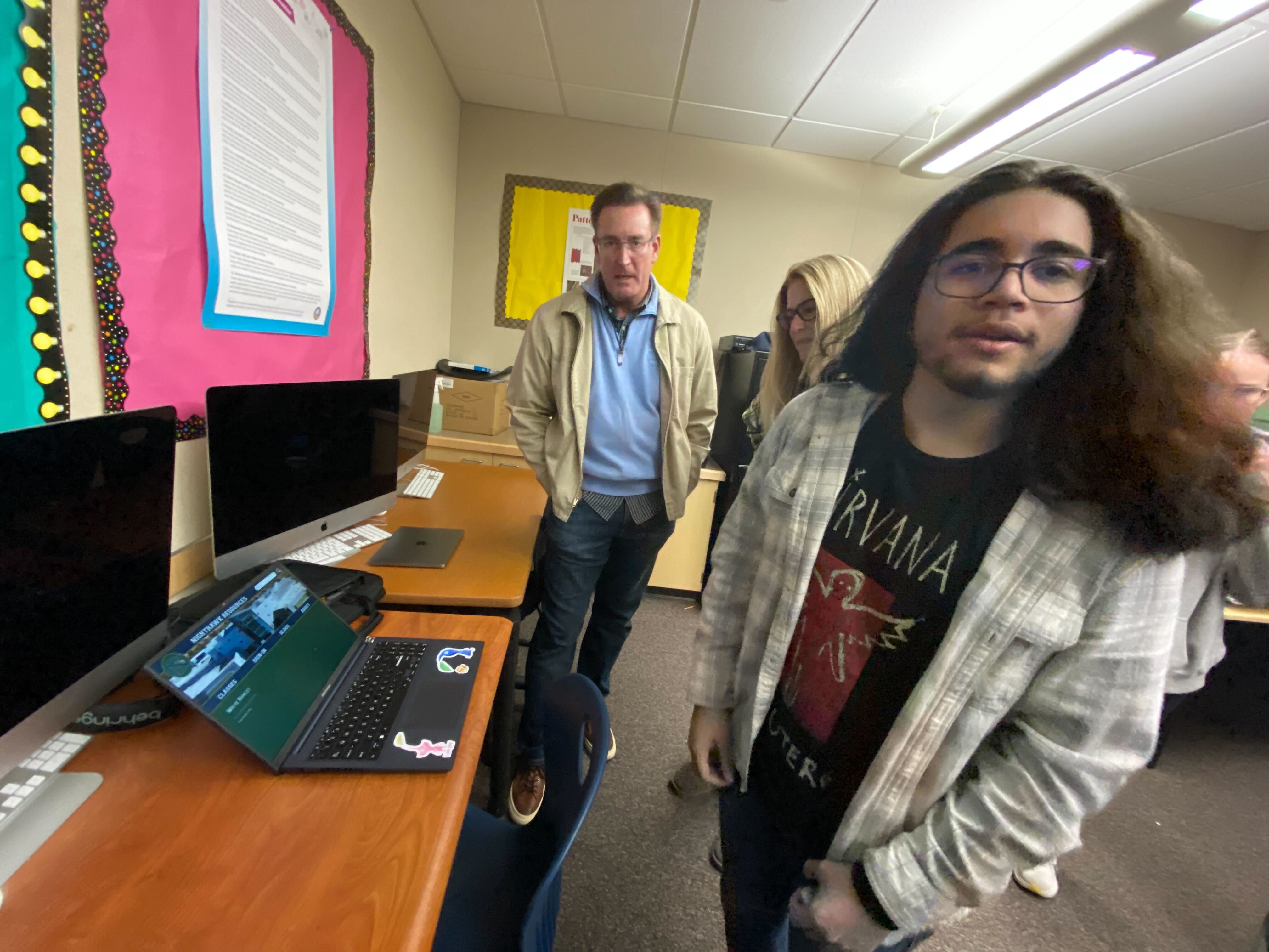
At the end of each of our presentations we tried to ask the people two things:
- How would you change or improve the features you saw today?
- What do you think about the site’s visual design?
We found that these questions were very productive, providing quite a bit of insight into how to improve our site for Del Norte students who would be using it. These notes can be seen in the team issue linked here.
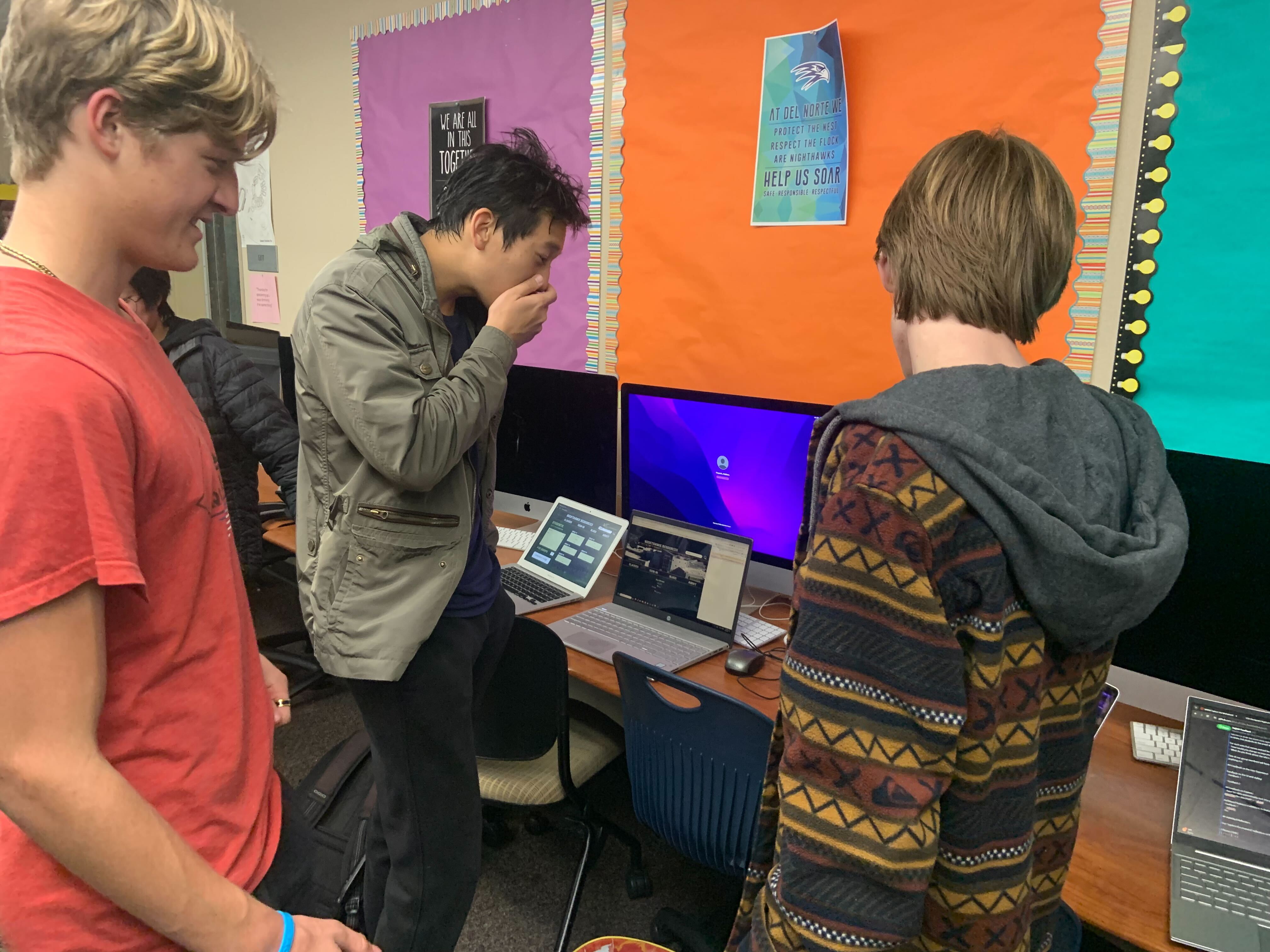
We also watched live interactions with our site to gauge how people responded to and interacted with the frontend. We found that directly linking assignments and classes to their cards on the dashboard, as Canvas does, was very intuitive and excited a lot of users. Multiple users also created assignments for classes, but ended up with some difficulty navigating back to the dashboard to look at them. We want to make sure that we make the connections between pages extremely clear, as one compsci parent emphasized.
More Images
Glows and Grows
We reflected on specific notes on our team issue linked here. Here are some glows and grows specific to my area of focus in the project, however.
Glows
Some comments I received when presenting the dashboard and displaying assignment/class data were:
- The theming of the dashboard looks good with the rest of the site.
- It is convenient to go straight from the login page to the classes dashboard.
- The ability to click on an assignment and go straight to its info is intuitive.
- The formatting makes the text easy to read.
Grows
I was mostly focusing on grows that could benefit our project, so there are more to be heard of here.
- Assignments should be displayed more vertically than horizontally on the dashboard
- This would also allow for more horizontal space to be used to include a brief preview of assignment content/an image representing the class it’s a part of
- Include how long the user has left until the assignment will be overdue
- This prevents the user from having to do the math and overall improves user experience
- Data science features should be listed separately from the dashboard
- This was already the plan; they were only added for the sake of our two-minute demo and ease of access in the short-term
- The styling of the page should overall be dumbed down more, according to a compsci parent
- While she complimented its existing styling, she said that everything could be made bigger and provided with more instructions to increase the intuitive user interaction process
- Assignments that are overdue on the dashboard should be a different color/include a bright icon
- This will be a part of implementing submissions to assignments
Project Improvements Based on Feedback
- Remake the wireframe for our dashboard following user login to dumb it down/make it easier to read
- Increase the size of class cards and add an identifying image/color
- Make assignments displayed more vertically so that there is horizontal room for more info
- Instructions on accessing the class (where to click, etc.)
- Use colors/add an icon to assignments that are missing/late
- This will be part of implementing the submissions for assignments
- With image recognition and graphing: convert data to CSV
- This is a great way to intermix the graphing and image rec
- Overall design: make all pages fit with theme, and make that theme customizable
- Aiden: Probably part of the overall site CSS/SASS would be changing all of a certain color in a settings menu accessible on each page, wireframe needed
- Separate data features from classroom features on dashboard, which was a prior plan
See our team issue linked here.
Other Compsci Groups
After our presentations, we went on a tour of both rooms to see if any other groups had some inspiring content for us. We were very impressed by the ideas of most groups, though the purpose of some was a little confusing.
Games
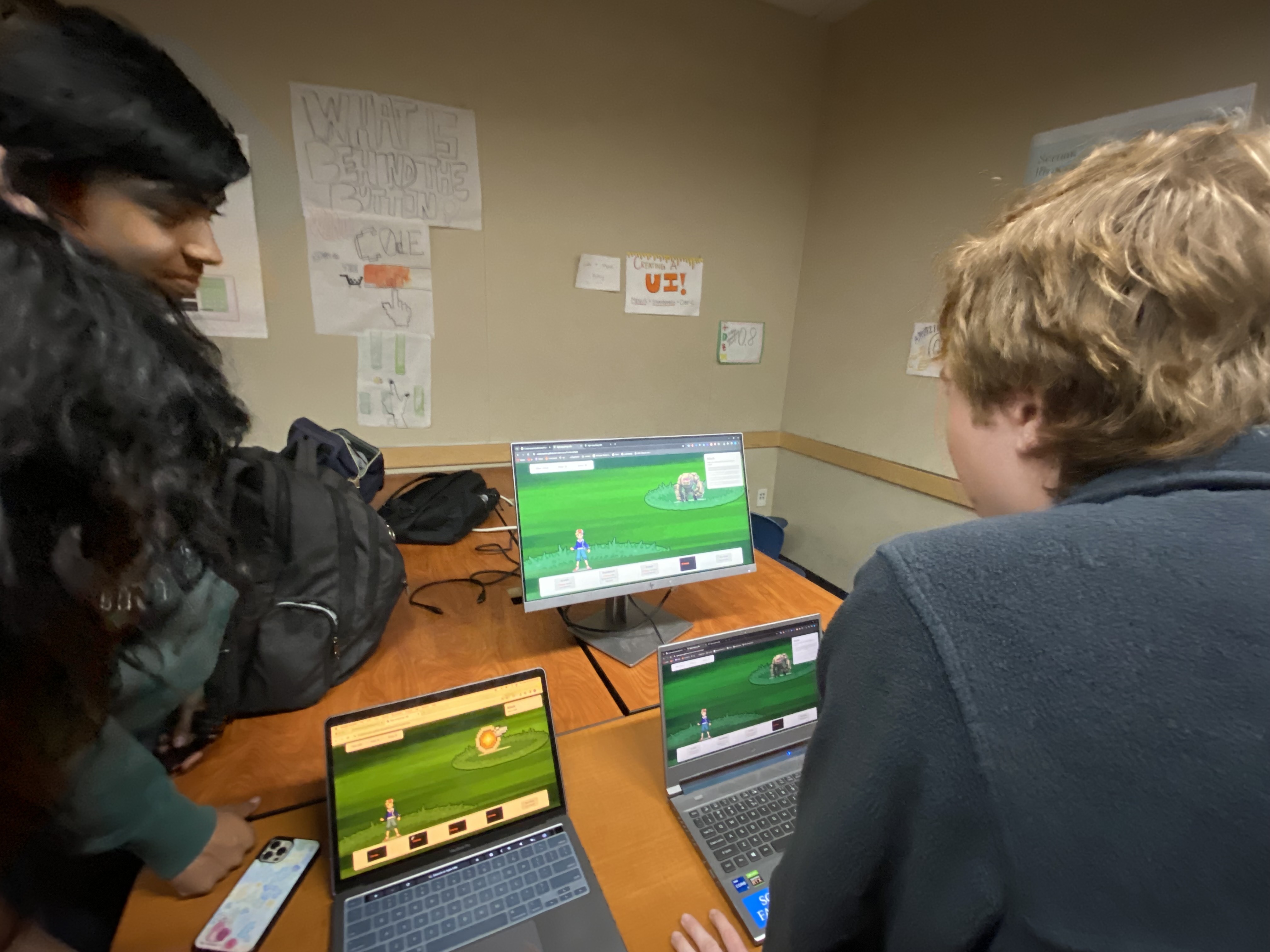
A lot of groups made games.
Our project is like an anti-game, where it’s entirely focused on having a useful purpose. Seeing so many other groups making games made it somewhat challenging to take feature ideas away. Much of the inspiration we got was design-based.
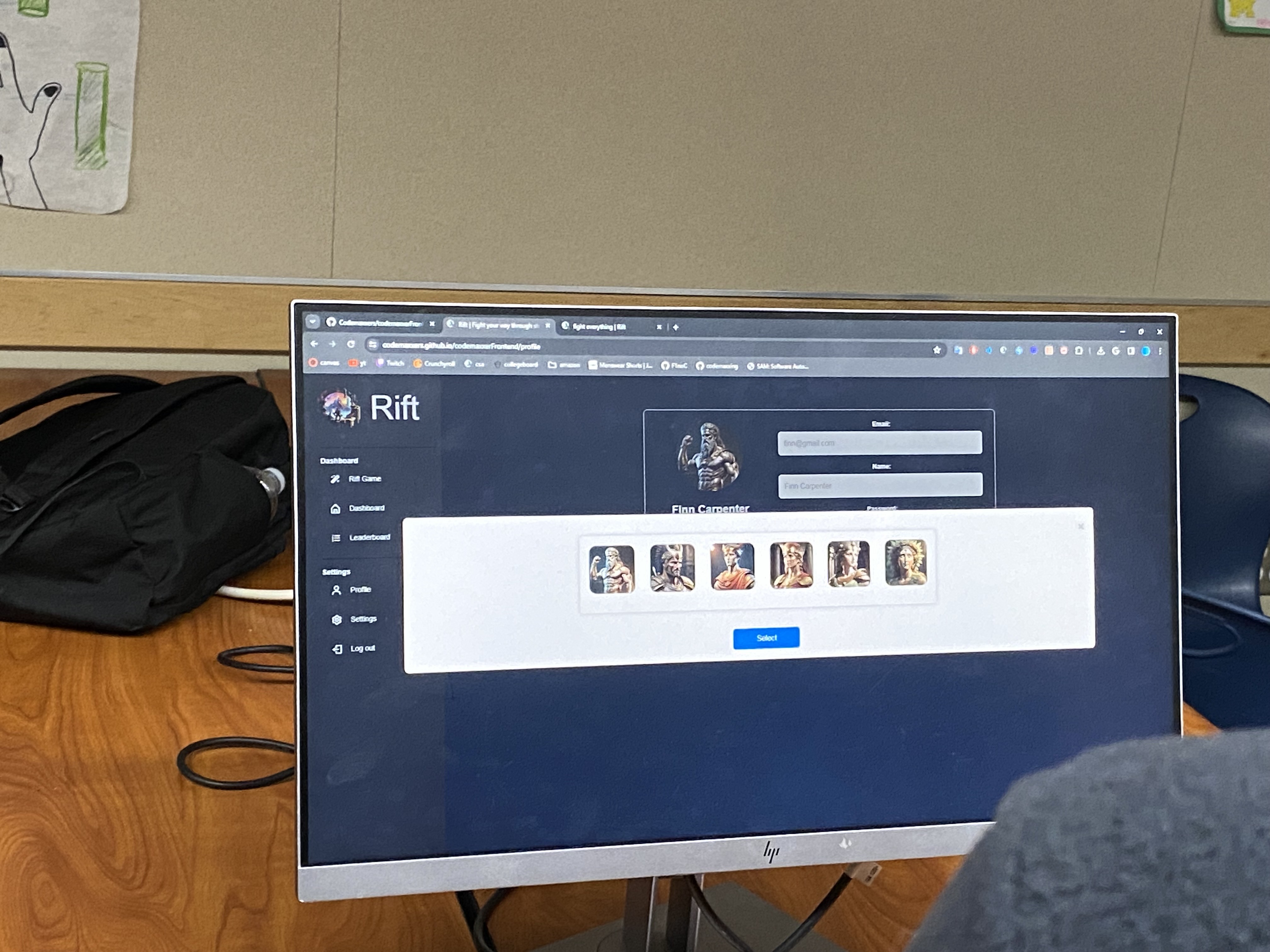
This game by the Rift group was inspiring from a frontend perspective. It was very intuitively-designed. The left utility bar was most inspiring, as we considered if, especially in pages like dashboards or class displays, user data or redirects could be listed off to the side.
We weren’t inspired by all frontend designs, however.
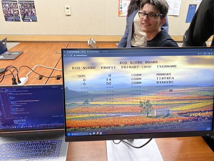
Useful Programs
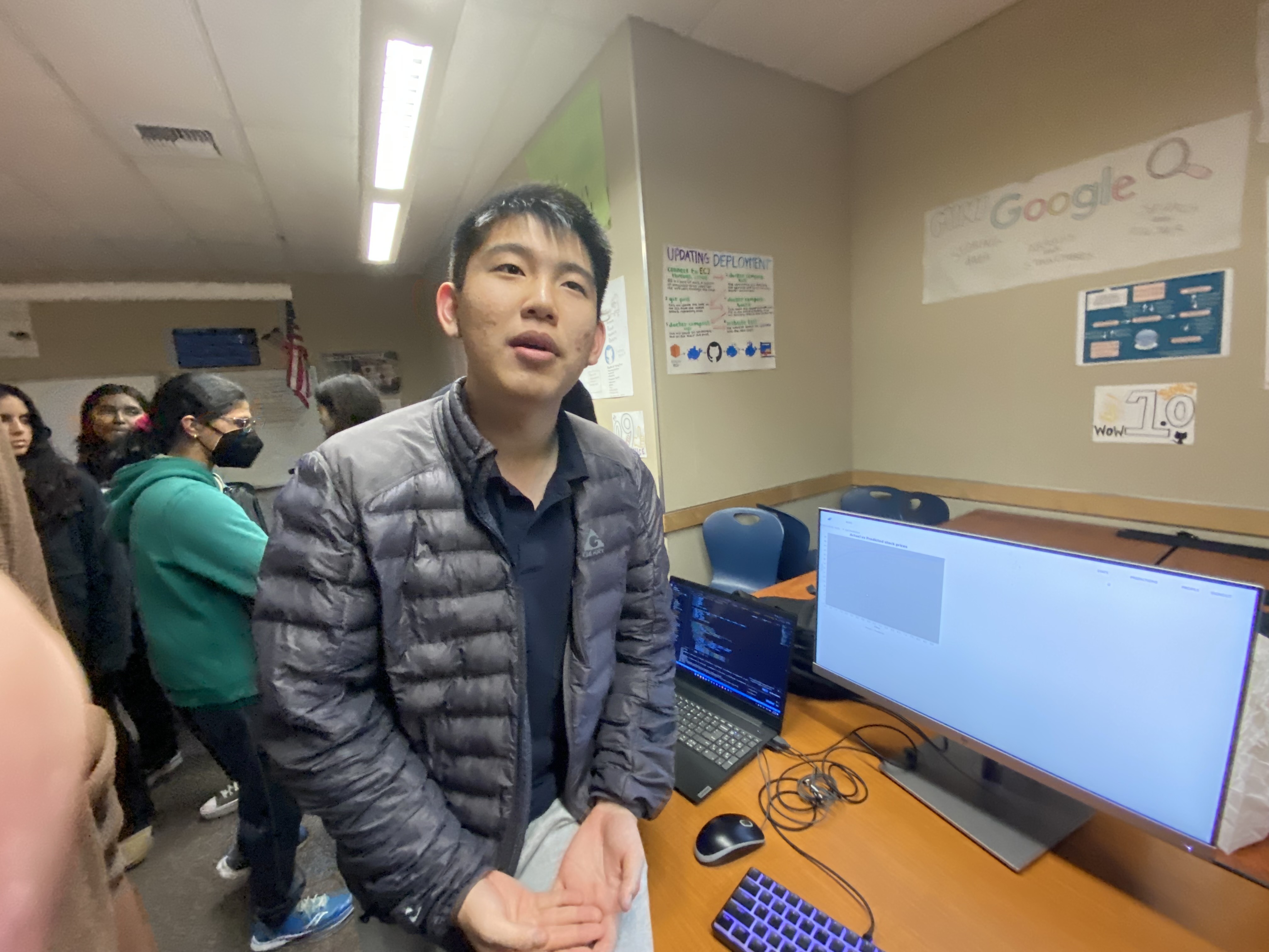
The few we saw were very interesting, even if their functionally wasn’t entirely reliable at times. We were especially invested in the group with Alex, David and Ethan because their purpose seemed genuinely beneficial.
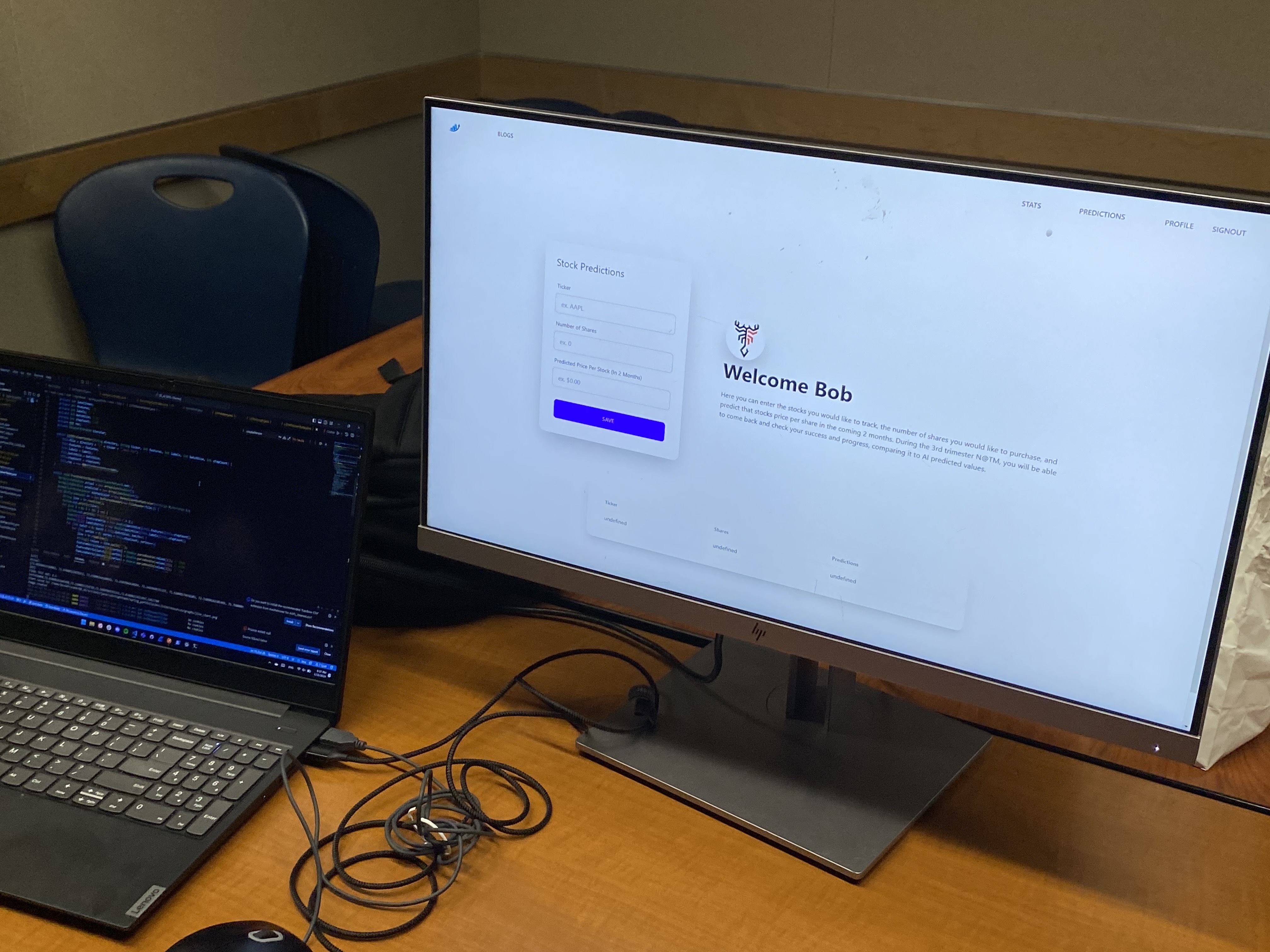
While we did see that their graphs weren’t exactly reliable every time, David’s minimalist frontend design was as intuitive as ever and they talked through their features very succinctly and investingly.
We talked to them about how they displayed the data graphically, since that’s a large part of our project. We already have a JS library in mind that will be used to represent a data set, but we’re still considering how to show other types of graphs like histograms, dot plots and box plots. They didn’t have those types of graphs, but they discussed how we might go about manually creating them. Toby wants to use a library.
Here’s a different site we looked at:
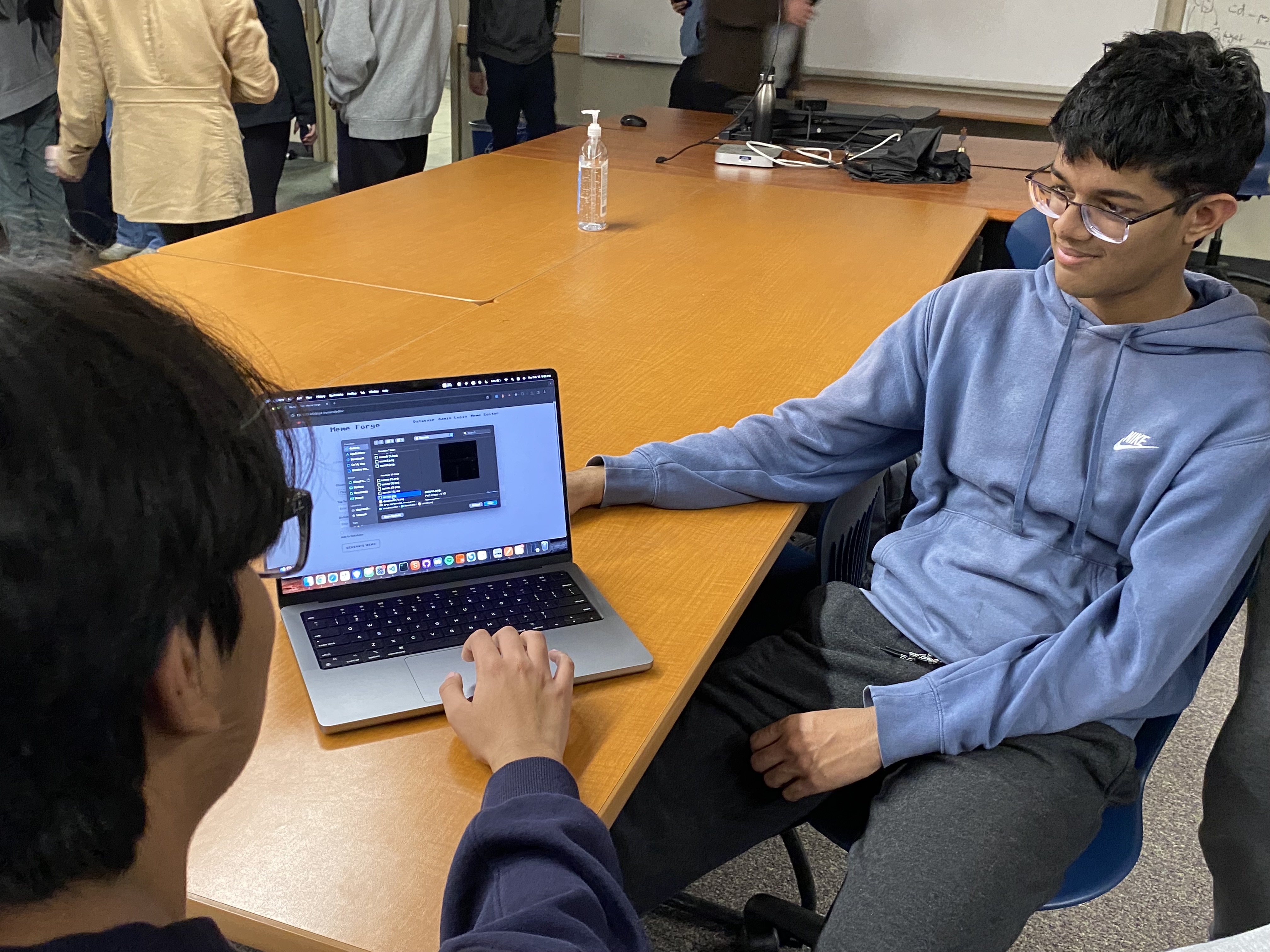
This was a meme storage site. While it definitely sounded like iFunny or something even more wretched than that, teh feature of being able to easily save images to be displayed from a database was very pertinent to our current ambitions with assignment attachments and identifying ClassPeriod images.
Other Classes’ Displays
Some JCC members went around and looked at arts classes together. We were very impressed or excited by
Digital Media
Most of the QR codes were mislinked. We think our QR code generator may come in useful if applied to only one link for these people.
3D Animation
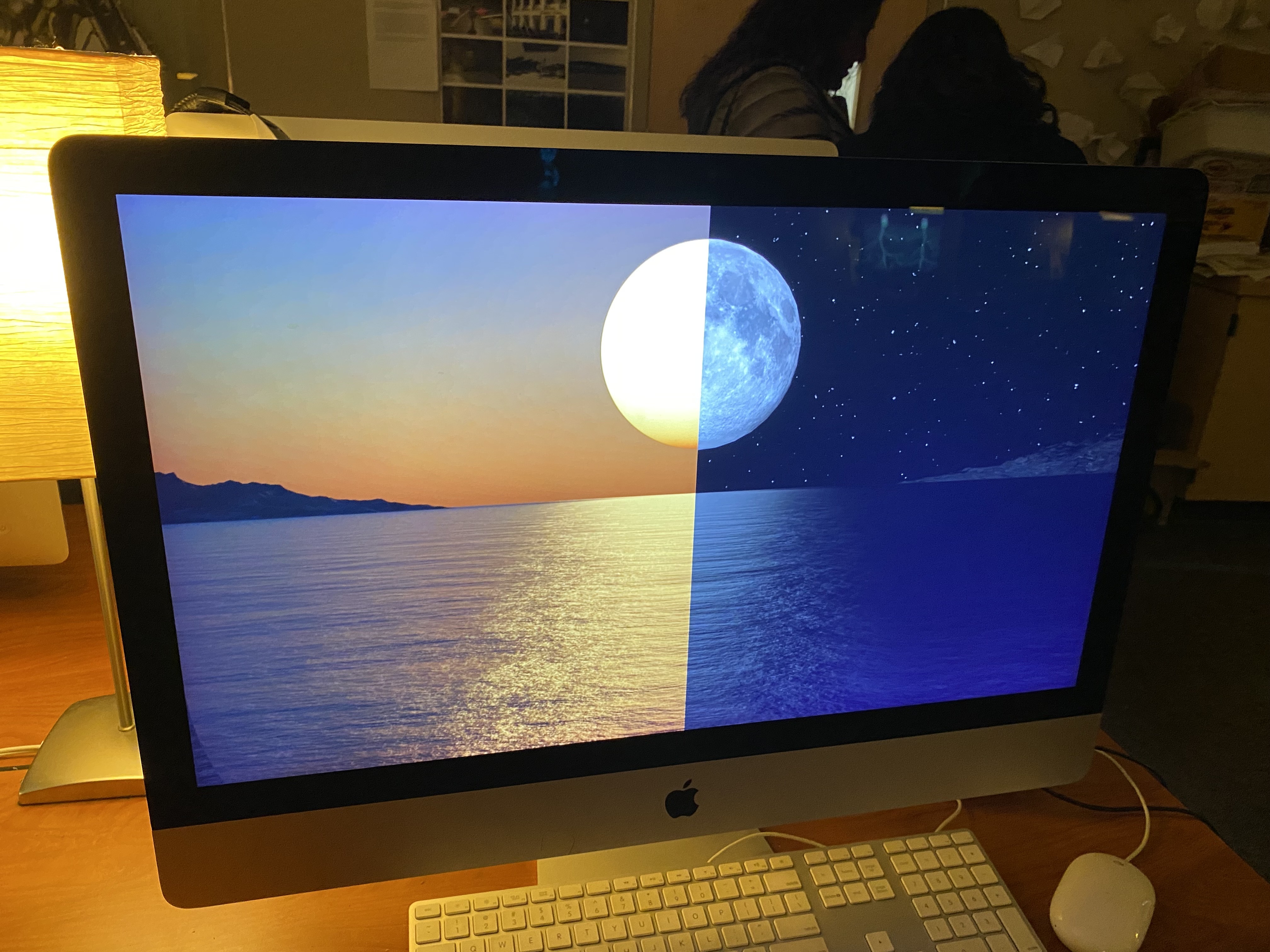
We weren’t quite as enthralled this trimester with the renders, but we thought the renders that cover ligthing at different times of day were interesting. It reminded us of light mode/dark mode websites and how they mimick these sorts of contrasts.
AP Studio Art
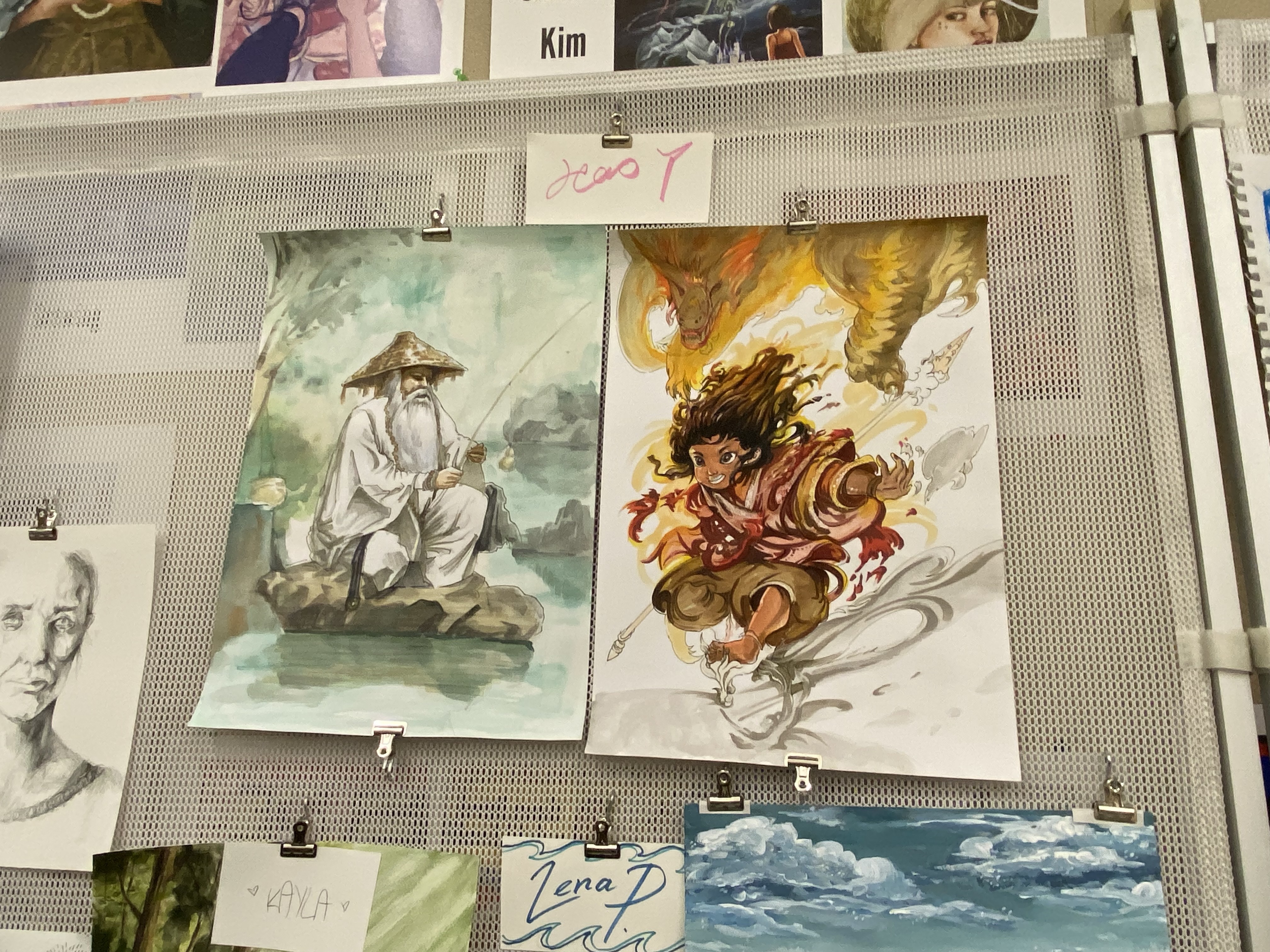
We also liked a lot of studio art, but we were especially big fans of this artist’s paintings. They’re very intentionally and gracefully chaotic, and stick to a unique art style.
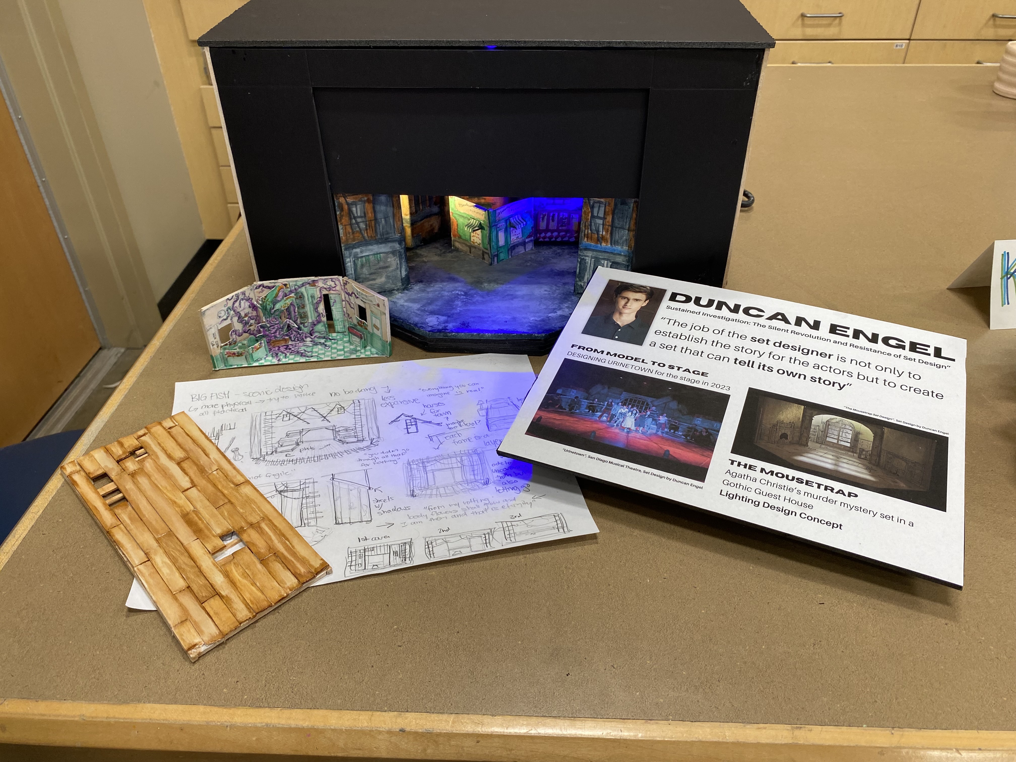
These are Duncan Engel’s set design renders. He’s an incredibly talented designer and it’s a crime that we did not utilize his set design in Little Shop of Horrors.
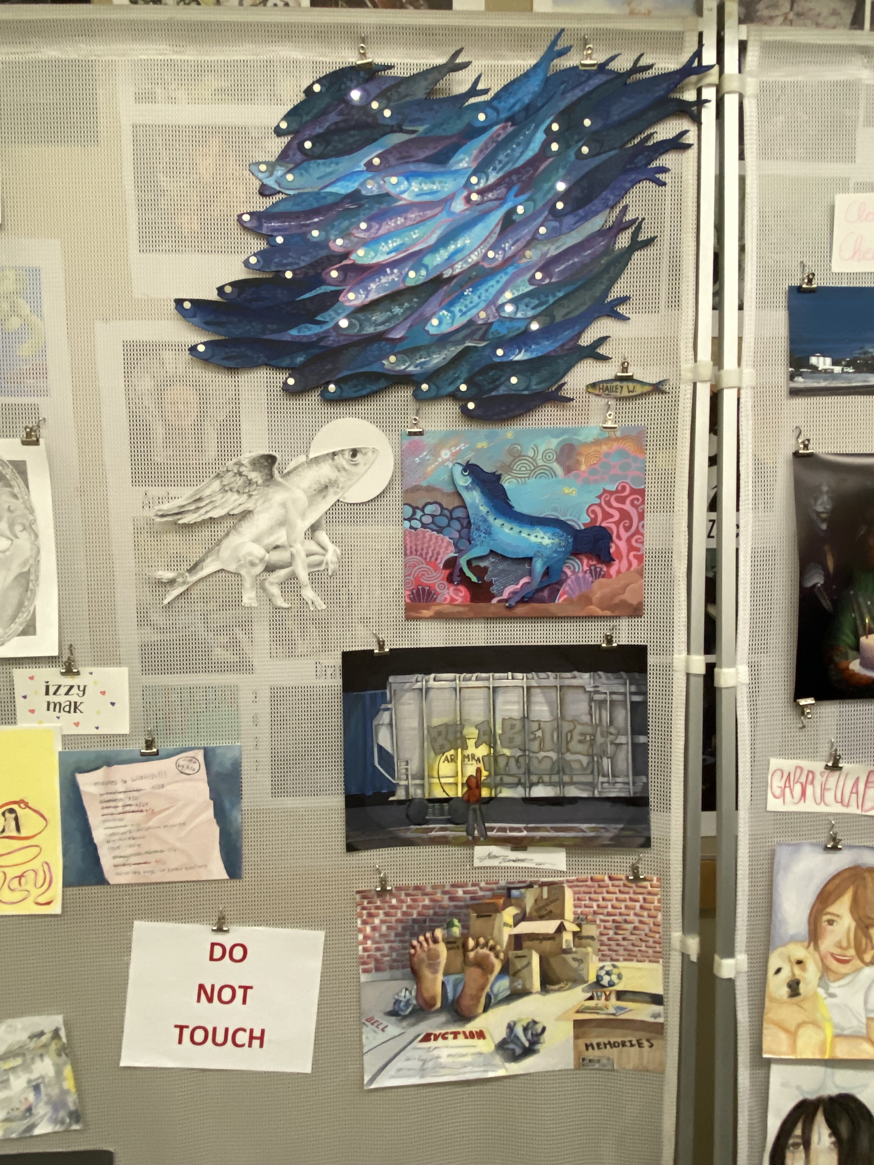
The fish chimera creatures this artist made were very intriguing.
Ceramics
Not to end on a sour note, but we also weren’t as thrilled as usual with the ceramics this year.
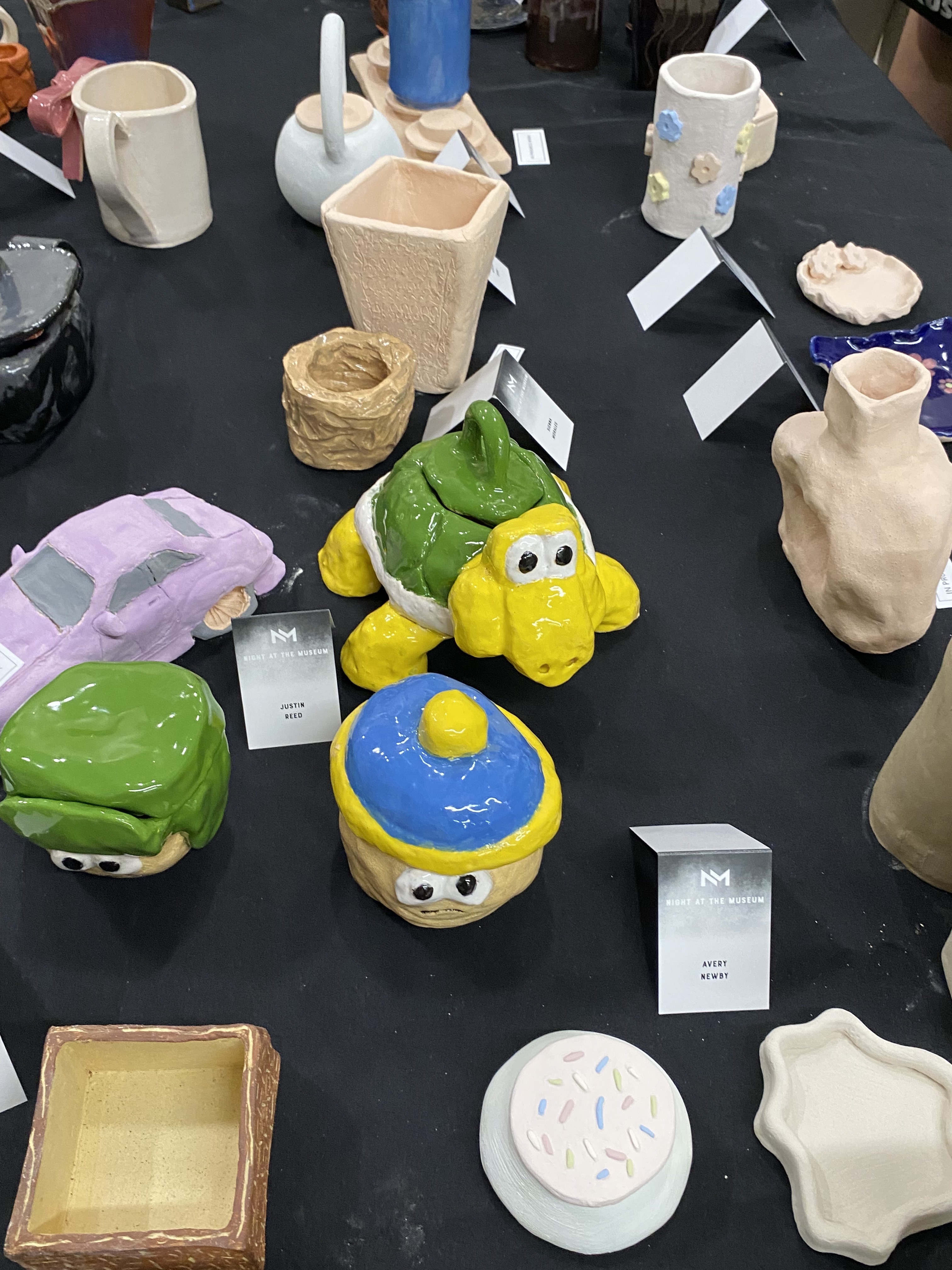
These were my twin brother’s projects. I really like the Koopa Troopa teapot. Apparently it actually works.